

*I published an edited version of this project writeup on Medium, highlighting 5 of my learnings. The post was syndicated by Mattermark (newsletter) and Geektime. Read the Medium version - here.
OBJECTIVE
Run a two-week design sprint to build a feature into Wunderlist mobile that allows users to find interesting things to do, see, and participate in based on their current location.
BACKGROUND
Wunderlist is a popular and beautifully made to-do list application developed by 6Wunderkinder out of Berlin, Germany. The developers of Wunderlist recently pushed a feature that allows people to publish selected lists and open them up to the public via unique urls. Currently there is no list discovery feature built into the application, although Wunderlist has announced such a feature is in development.
I was inspired by the new feature, and wanted to propose one possibility for Wunderlist's discovery platform: a feature that would allow users to find interesting things to do, see, and participate in based on their current location. With this opportunity, people would be able to filter all the world's lists and find the things that are relevant to them at that moment - starting with a simple ‘Nearby’ button.
PROCESS
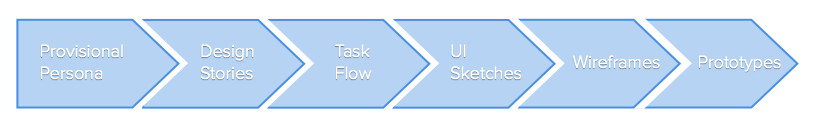
PERSONA
My first step was to create a provisional persona. I wanted to visualize a real person and get a grasp on her needs and goals, as well as what problems she might be trying to solve. This allowed me to get a more in depth look at possible ways she might interact with the application in realistic scenarios.
DESIGN STORIES
I wanted to focus my attention on the most important features that would allow Kate to accomplish her goal. Using the persona as a guide, I drafted design stories and organized them into epics - high-level stories that capture the scope of the individual stories.
Epic: The user can tag their personal lists with a location.
- Add an address to a list
- Edit an address on a list
- Remove the address from a list
- Place a location pin on a map
- Remove a location pin from a map
- Confirm the list location
Epic: The user can find published lists based on location.
- Search local public lists by category
- Search local public lists in a map view
- Search location through a gesture-based, omnidirectional map
- Refresh available lists when map is moved
- Search public lists by what users mark as nearby
- Search nearby lists by popularity
Developing these epics and design stories helped me determine the scope of the project. By picturing the individual steps Kate would take to solve her problem on her mobile device, I got a more comprehensive view of what I should focus on designing. It also allowed me to uncover a few of the edge cases that might be experienced when navigating through the application.
With my refined vision, I turned my focus to task flows.
TASK FLOWS
I constructed two task flow diagrams to discover how to implement these new features into the existing product. With a concrete idea of how Wunderlist’s current application is laid out, I could better envision where to add touch points for users to discover and implement the features into their current list-making process flow. I sketched out a few drafts on paper, and solidified my ideas in Gliffy. When I was happy with the task flow layout, I got out my pen and paper to work on some UI sketches.
UI SKETCHES
I brainstorm mobile flows through rapid fire UI sketches. It helps make the task flow more concrete and gives me a better understanding of how the user might actually interact with the application. The pen and paper approach allowed me to generate a lot of ideas quickly, test them in a crude way, and iterate repeatedly once I have a direction I'm comfortable with.
Below I've included the first versions of the interface and flow I had envisioned. They vary significantly from the end product, which is a lot more streamlined, intuitive, and economical in interactions - design principles I believe are significant to the current Wunderlist experience.
WIREFRAMES
With a solid understanding of the task flow, I was able to reduce the number of screens I would have to create and was therefore ready to move on to digital tools. I took screen stills of Wunderlist’s existing UI and transferred them into proto.io, where I was able to build wireframes over the top and quickly iterate on them - adding the new touch points and paring away what became superfluous. It was my first experience using proto.io, and I was excited to work with the interaction feature and build screen transitions as I moved along. It was helpful to see how the task flow worked with the mobile UI, so as I missed an essential interaction, I could address the problem faster than in previous projects.

Scenario #1: Kate has created a list of her favorite taquerias around the neighborhood she works. With her new list, she opens the public settings menu, selects ‘add location’, and either drops a pin where she is or enters a specific address or neighborhood.

Scenario #2: Kate is visiting the Mission District in San Francisco for the first time. She wants to learn what taquerias people have determined are the best in the neighborhood. She opens Wunderlist and selects the ‘Nearby’ feature where she can scan categories, popular lists, or check out the map view where published lists show up as pins. When she finds the one she likes, she adds it to her personal collection.
CONCLUSIONS
INSIGHTS & LEARNINGS
As shown in my initial UI sketches, I had originally placed the 'Nearby' feature on the 'Search' screen. Throughout the design process, I talked to a lot of people to learn more about how they discover interesting things in places they are unfamiliar with. The insights I gained were predominantly about finding people with local knowledge and expertise. This inspired me to give the 'Nearby' feature an upfront presence, where people are more likely to appreciate the flexibility of the application, and learn to use it for adopting expert lists as well as creating their own.
I was able to appreciate the iterative process of testing my assumptions with real people, and learned to ask how problems are being solved at the very beginning of the design process. This would save me time on the front-end of my design process, rather than backtracking and patching the solutions I assume would solve the problem.
NEXT STEPS
To move forward with this project, I would test the features with current Wunderlist users to determine:
- If these are features that would add value to their current experience using Wunderlist; and
- If these mobile flows are discoverable, intuitive, and usable.
If these tests proved successful, I would develop higher fidelity mockups and work with engineers to understand the feasibility, timeline, and cost of implementation. Once implemented, I would perform quantitative testing to determine if these features increase the Wunderlist adoption rate and improve user retention.
I am a UX designer at Tradecraft and not affiliated with Wunderlist - I'm just having fun with a service I use and enjoy.
This feature design was completed in September, 2014. Screen stills and mockups reflect the product at that time and is likely to have changed since.